Homedit.com Interior Design & Architecture Inspiration Newsletter | .png) |
- 7 Ways To Create & Display A Photo Collage
- Miniki – a clever and bold solution for tiny kitchens
- DIY Framed Triangle Patchwork
- Small and energy-efficient home in Santa Ynez
- A cozy loft inside a former radio factory
- The Somnio suspended chair by Frederic Julian Rätsch
- The most beautiful brick interior design in Paddington, Sydney
- A beautiful four-bedroom villa in Spain
- The Versatile And Comfortable Bach Basics Atoll
- Get your furniture from a box
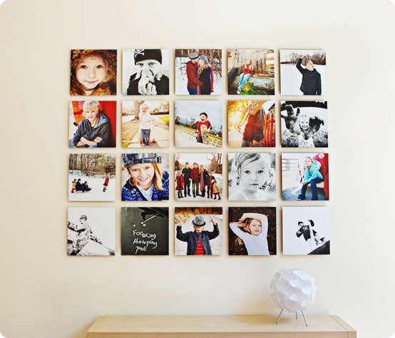
| 7 Ways To Create & Display A Photo Collage Posted: 06 Sep 2012 10:04 AM PDT Whether you are a professional photographer, a lover of vintage Polaroid film or just have a lot of fun memories you’d like to show off around the house, we have some exciting and new inspiration on how to display all those photos. It’s gets boring just slapping them up on the wall, in a row, side by side. Instead, create a funky collage. And there are so many unique ways to do so!! 1. The Rubik’s cube style.
Take some of your absolute favorite, most beautiful photographs of your family and friends and have them blown up and put onto a canvas. Then display them like so. It’s architectural, contemporary and totally reminds me of the right side of a Rubik’s cube!
2. The vintage DIY style.
Okay, so snag some chicken wire out of the garage, a vintage, thrifted frame and get to work. Take out your photo box and pick several of your favorite photos. Then have a go at arranging. This is such a fun way to display your pictures … with a bit of an edge! 3. Hanging from the sky style.
If you’d like something with a bit of romance and whimsy, then hang your favorite photos from the sky! use chicken wire, ribbon or thread! And make sure you use some fun frames. 4. Chaos style.
If you’re feeling like your home needs something a bit more eclectic try “a wall of” style. Without any rhyme or reason start hanging up your photos. Once completed, it’ll be personalized, unique and all your own (with some artsy vibes to go along with it, of course!). 5. Floating cloud style.
Like a cloud, gently blowing in the wind, gather up a cluster of your favorite photos and create a similar small design. It’ll give texture, art and edge to the wall. And, it gives the illusion of a small cloud of photos just floating around your walls. 6. Heart style.
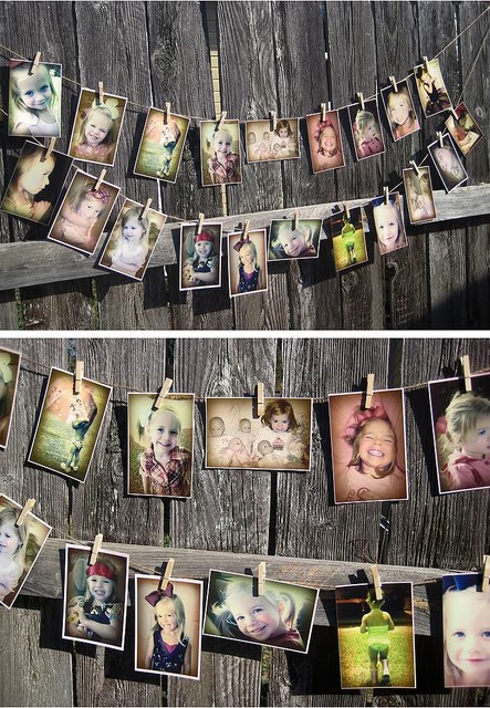
So simple, sweet and precious. For your children’s photos, big family photos or your wedding day photos … display them in a heart! The symbolism is perfect, it’s different and easy to do! 7. Clothesline style.
This is a fun, playful and completely unique way to display your “naked” (without frames) pictures. Just like you would with some of your wet clothes, DIY or find some snazzy clothespins and hang them for everyone to see. Subscribe to Homedit's Feed to get constant updates of our Awesome Posts!© Homedit- Daily interior design ideas ! | Permalink to 7 Ways To Create & Display A Photo Collage |
| Miniki – a clever and bold solution for tiny kitchens Posted: 06 Sep 2012 08:38 AM PDT In a tiny kitchen there's not much space for furniture. It's why we need to get creative on this chapter. It's important for a kitchen to have enough storage space for all the appliances, tools and supplies needed when preparing the meals. Miniki makes that problem easier with its compact and yet very functional design.Miniki allows you to transform your kitchen into an airy and practical space, like it should be. It gathers multiple functions into one structure and thus allows us to stay away from cramped, unpractical kitchen decors.
This way we have enough free space for when we simply want to socialize and still have everything we need for preparing a delicious meal when needed. This compact unit is composed of three modules. Two of them have the dimensions of 24″ x 24″ x 24″. They are two compact cubes and, if you prefer it this way, they can also be purchased as a double length module.
These cubical structures can be used as freestanding pieces or combined. They can also be adapted to house a hidden sink, stovetop, storage space, dishwasher, refrigerator and even an oven. It's amazing how such a small unit can incorporate so many different functions. When these functions are not needed, the module can be closed. It thus becomes a minimalistic, compact unit with a spacious counter space that can also be used as a breakfast table. Miniki comes in 15 different color combinations. Subscribe to Homedit's Feed to get constant updates of our Awesome Posts!© Homedit- Daily interior design ideas ! | Permalink to Miniki – a clever and bold solution for tiny kitchens |
| Posted: 06 Sep 2012 07:56 AM PDT These days I was invited to the school where I work to see the wonderful things the pupils made with their own hands. Origami figurines, bracelets, earrings, artisan objects and many more were just a part of their collection. This collection is meant to bring pupils a lot of personal satisfaction, admiration from everybody who can see their work, appreciation and some money in case they manage to sell some of these objects to a special fair.
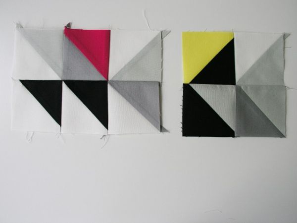
If you want an interesting idea for your own collection or an easy way to decorate your room you can inspire yourself from the following DIY project. Triangle is the basic idea for this type of project which refers to the way you can get a personalized DIY Framed Triangle Patchwork. It is an easy and cheap DIY project which you can make it at home and even use some recycled materials. You may choose the colors that you want for your triangles and use your imagination for all kinds of combination of nuances you can use and different patterns you can make.
You need some pieces of fabric of various colors and of medium weight, a rotary cutter, a straight edge and cutting mat or you may replace all these with a pencil, a straight edge and scissors. Then you will also need some straight pins, a sewing machine or needle and thread and an iron and ironing board. Now you are ready to start working and make your own DIY Framed Triangle Patchwork.{found on brettbara}. Subscribe to Homedit's Feed to get constant updates of our Awesome Posts!© Homedit- Daily interior design ideas ! | Permalink to DIY Framed Triangle Patchwork |
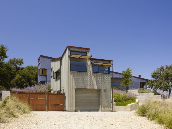
| Small and energy-efficient home in Santa Ynez Posted: 06 Sep 2012 06:54 AM PDT Located in Santa Ynez, CA, USA, this residence has a contemporary design and it embraces the beautiful landscape around it. Its owners contracted Fernau + Hartman Architects for this project. They had few but clear requirements. They wanted a small, energy-efficient home that would take advantage of the beautiful surroundings and would integrate well in the rural area.
The residence was built in 2010 and the architects that designed it worked closely with landscape specialist Pamela Burton & Company and with several other specialists for the mechanical part, the lighting system and everything else. Together they managed to create this beautiful home, the materialization of its owner's mind picture. The owners are passionate art collectors and former gallery owners so they also required a separate studio/guest house where they could work and display their beautiful collection pieces.
The residence has two bedrooms, a pool, a series of outdoor areas and a barbeque space. Visually, the design of the house is very well balanced. The whole project was envisioned as a structure that connects to the landscape, that embraces the beautiful views and everything around it. The main volume is east-west oriented and it contains the living and dining space, along with the master bedroom. The studio or guest house is a separate volume. Both structures share a series of outdoor spaces. Subscribe to Homedit's Feed to get constant updates of our Awesome Posts!© Homedit- Daily interior design ideas ! | Permalink to Small and energy-efficient home in Santa Ynez |
| A cozy loft inside a former radio factory Posted: 06 Sep 2012 04:49 AM PDT When a building such as a factory, an office or even odd spaces such as a church or a light tower are no longer used they get abandoned. There's not much you can do with them, given their specific designs. However, ambitious architects and designers manage to revive these spaces and turn them into commercial spaces or cozy homes. This apartment, for example, is inside a former radio factory.
The loft apartment is located in Vilnius, Lithuania in a former radio factory that has been abandoned for several years. The space was transformed and repurposed. It was an ambitious project by Dmitriy Kudin. Given the original structure of the building, the space dictated an open plan. While transforming the factory, its original structures were also exposed. Most of the main elements were preserved as a testimony of the past but the smaller details and everything else had to be reorganized and redesigned.
The loft has a contemporary design. The remains of the factory also give it an industrial touch. The rooms have high ceilings and there's a sense of openness everywhere you look. The living areas are large, open spaces. The furniture is minimalist and the décor is simple and casual. What's surprising is that the apartment feels cozy despite the fact that it's inside an old, abandoned factory. It's amazing what a few changes can accomplish. Subscribe to Homedit's Feed to get constant updates of our Awesome Posts!© Homedit- Daily interior design ideas ! | Permalink to A cozy loft inside a former radio factory |
| The Somnio suspended chair by Frederic Julian Rätsch Posted: 06 Sep 2012 03:20 AM PDT What would you think if, one day, you would to go the forest to enjoy a few relaxing moments in nature, and you saw someone just sitting in a chair that's attached to a tree? You would most likely find it odd but, at the same time, you would notice that the person sitting in that strange chair seems to be very comfortable. You would end up wishing you had one for your own.
Even though it seems odd and strange, such a chair really exists and it can provide you with a unique way of connecting to nature and of experiencing new levels of relaxation. The chair is called Somnio and it was created by Hamburg-based designer Frederic Julian Rätsch. Somnio is a suspended chair that was designed to literary hug the trunk of a tree. The chair can be fixated to an attached belt on the upper end of the backrest.
This mechanism allows the user to attach the chair to the trunk of the tree without damaging the bark. The tree doesn't suffer and you have a new way of finding relaxation in the forest. The chair connects to the hardwood by pressing against the seat pan through a load within two parallel legs. All you need to do is find a tree with a structure that allows you to attach the chair and do simply relax and connect with the surroundings. Subscribe to Homedit's Feed to get constant updates of our Awesome Posts!© Homedit- Daily interior design ideas ! | Permalink to The Somnio suspended chair by Frederic Julian Rätsch |
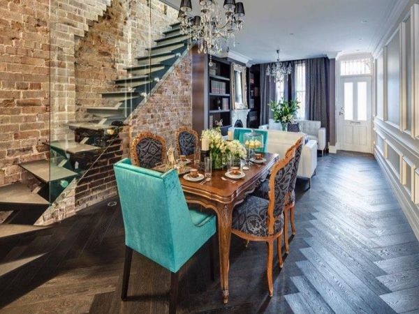
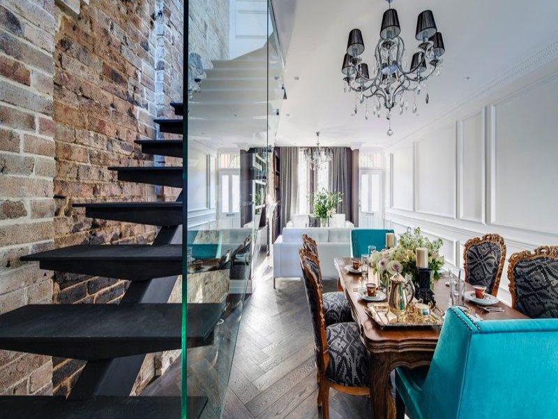
| The most beautiful brick interior design in Paddington, Sydney Posted: 06 Sep 2012 01:15 AM PDT This house is located in Paddington, Sydney. It might look like just an ordinary building from the outside but inside it hides many beautiful details. The house has three levels and it has been recently redesigned. It was transformed from a modest-looking structure into a luxurious inner city pad. Inside you can see the results of this major transformation.
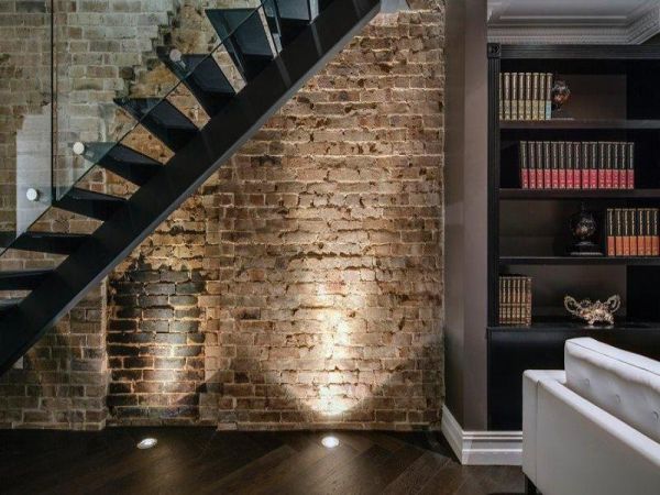
The house is full of contrasts. We have here a series of rough brick walls complemented by delicate textures, velvet, leather and silk surfaces along with many stylish decorations. The exposed brick walls are an interesting accent feature. They don't really have anything in common with the rest of the décor but they do bring a unique flavor into the mix. They beautifully complement that wonderful staircase. The way it stands out against the wall is marvelous.
These contrasts of texture can also be found in other areas of the house. For example, in the kitchen we have marble that is combined with polished concrete. These rough elements bring a rustic and also industrial touch to the whole décor. The glass and steel staircase does the same thing but in a more delicate and subtle manner. As for the furniture throughout the house, it's a mix of classical and modern. The color palette includes tones of brown, grey and, of course, black and white. There are also a series of accent pieces that feature brighter and more dynamic colors.{found on site}. Subscribe to Homedit's Feed to get constant updates of our Awesome Posts!© Homedit- Daily interior design ideas ! | Permalink to The most beautiful brick interior design in Paddington, Sydney |
| A beautiful four-bedroom villa in Spain Posted: 06 Sep 2012 12:23 AM PDT This beautiful estate is located on Costa Brava, Spain. It's a property that includes an amazing villa that dates back to the 1950s and a guest house. Originally, the main volume was a one-story fisherman's house. It was expanded and replaced by this splendid villa with views of the Mediterranean Sea and the bay of La Fosca.The villa has a white stucco construction and a red tile roof. It maintains the original design of the era when it was originally built.
It has a beautiful arched front entrance and terra cotta floors that give us a taste of its original charm. The entrance opens onto a hallway. On the left side there's a large space that includes the living and dining area. This volume has a working fireplace, white beams and glass doors. It also has access to a terrace with views of the bay.
On the right side there is a kitchen with white marble countertops, a breakfast bar and beautiful oak cabinets and shelves. On the same side there's also a bathroom and a bedroom with views of the garden. The front hall features a staircase that leads to the second floor. Here you can find two more bedrooms located on opposite sides.
One of them is the master bedroom that also has access to a balcony. The guest house has both indoor and outdoor living and dining areas. It includes a master bedroom and a second bedroom with twin beds. It also has a kitchenette. The property has a two-car garage with a shower room.Listed on site. Subscribe to Homedit's Feed to get constant updates of our Awesome Posts!© Homedit- Daily interior design ideas ! | Permalink to A beautiful four-bedroom villa in Spain |
| The Versatile And Comfortable Bach Basics Atoll Posted: 05 Sep 2012 10:49 PM PDT Beanbags are some of the most comfortable pieces you can imagine. They have the advantage of being flexible and adaptable and being able to change their shape according to the user's position, body structure, etc. This means that anyone feels like the beanbag has been made especially for him. It's something you can't get from regular furniture pieces. A piece such as the Bach Basics Atoll is also very versatile.
Given its minimalist design and shape, the Bach Basics Atoll can easily integrate in a variety of different spaces, both indoor and outdoor. You can use it in the living room and you can relax on it while watching TV, you can place it in the kid's bedroom or playroom, or you can take it with you outside by the pool or on the terrace. It's equally comfortable no matter where you put it.
Because of its soft and friendly structure, the Bach Basics Atoll is great for kids. It's safe, soft and fun and it would make a great addition to their playroom. It's something that both children and adults can enjoy and that will never get old. The Bach Basics range features marine-grade SurLast® fabric from Glen Raven and is available in three colors: navy, sand and charcoal. These are beautiful but rather neutral colors that can be easily combined with anything else. It's one of the reasons why this piece is so versatile. Bach Basics Atoll requires 360 litters of beans and measures 1500 mm (w) x 1500 mm(h). Subscribe to Homedit's Feed to get constant updates of our Awesome Posts!© Homedit- Daily interior design ideas ! | Permalink to The Versatile And Comfortable Bach Basics Atoll |
| Posted: 05 Sep 2012 10:00 PM PDT When I was little I loved to play with blocks. They made my game easier because I could transform them in every piece of imaginary furniture that I wanted. Sometimes I built tables, sometimes chairs or other things. Well, the blocks for adults and for real home were invented. The Boxetti Multifunctional Furniture is build on this principle. You can have more pieces a furniture in just one box. Based on the different rooms they were built for, these amazing articles take care of your lack of space in a very modern and luxurious mode.
Designed by Rolands Landsbergs these innovative pieces of furniture are very efficient and they are also high-tech equipped. Filled with drawers and other elements that give you plenty of space for your things, they come in different shapes and with different utility.
There’s the Boxetti Lounge that looks like a a white coffin-shaped box but transforms easily into a chair or a three-seated sofa or it could immediately become a coffee table. It could be used also like a desktop or an additional workspace. The Boxetti Lunch is in fact an entire kitchen into a box. It has his own fridge, his sink and a place for you to prepare the food. And it could easily transform into a table. Another piece is the Boxetti is the Thrill one. This one is very impressive because it has a TV and a built-in audio system for the moments when you want to listen to music.
But, there are also other types on Boxetti that could make your home look futuristic and amazing. Because they are very fancy and contemporary, they fit in every home and they will surprise you with their utility. And, it will also be funny for you to use them. Subscribe to Homedit's Feed to get constant updates of our Awesome Posts!© Homedit- Daily interior design ideas ! | Permalink to Get your furniture from a box |
| You are subscribed to email updates from Home Decorating Trends To stop receiving these emails, you may unsubscribe now. | Email delivery powered by Google |
| Google Inc., 20 West Kinzie, Chicago IL USA 60610 | |












0 comments:
Post a Comment