Homedit.com Interior Design & Architecture Inspiration Newsletter | .png) |
- Modern apartment with an Asian-inspired interior
- Intriguing furniture pieces made out of whiskey barrels
- Stylish and cozy attic office by Vasiliy Butenko
- 5 Velvet Accent Features For This Fall
- A refurbished 40 square meter apartment with a colorful interior
- The perfect Kindergarten
- Fanfare Clock from Saatchi
- Bring your Gadgets in the Shower
- The Sleek and Stylish Chimo Square Wood Rack
- Arion Lamp
| Modern apartment with an Asian-inspired interior Posted: 03 Sep 2012 10:38 AM PDT This apartment is exquisite and there are many reasons for that. One of them is the theme of the décor. There's a very strong Asian influence in the interior design of this space and there are many details that stand out. The Asian influence comes from designer Wu Chengxian who is responsible for this splendid project.The apartment combines minimalist contemporary elements with Asian-inspired details and the result is a beautiful and well-balanced mix.
The color palette is very fresh, serene and delicate but strong enough to make a statement.There are many different shades, not always easy to combine. In this case they are beautifully spread around the apartment and balanced with the accessories and the accent features. The background is neutral and somewhat warm. The blonde wood tones and the grey tiles are the perfect shades to complement all the other elements.
The atmosphere here is very calm and serene and this is partially due to the fresh plants that were used for the décor. Living greenery is very important for the whole design. It provides a soft and serene look that balances beautifully the modern lines of the furniture. The light is also a very important factor for the décor. The light here is very gentle and soft and gives a warm glow to the space that complements nicely the wood features. Subscribe to Homedit's Feed to get constant updates of our Awesome Posts!© Homedit- Daily interior design ideas ! | Permalink to Modern apartment with an Asian-inspired interior |
| Intriguing furniture pieces made out of whiskey barrels Posted: 03 Sep 2012 09:50 AM PDT Normally, the only secret that a whiskey barrel hides is the taste of whiskey inside it along with the recipe used to create it. However, a clever designer has found a way to change that. This is a collection of furniture crafted from recycled whiskey barrels. Numerous oak barrels are used to age the spirit and to give it unique aromas and flavors. Once they did that they can no longer be used for the same purpose. But then a new stage in their lives begins.
The barrels are often used to create something new, something unique, completely different than their original purpose. For example, they are used to make furniture. The pieces were designed by Gustaf Anders Rooth and crafted by Barrelly Made It (BMI), the designer creates pieces from reclaimed whiskey barrels from American distilleries and wine barrels from local and Northern California wineries. Each component of the barrels is reused and nothing goes to waste.
Among some of the most interesting and intriguing pieces of furniture created from whiskey barrels we can mention a series of stools with different designs and of different dimensions, coffee tables, side table and even a very unusual lounge chair. It takes imagination and creativity to create something like this and it takes time to create these designs. Each piece is unique and is a one-of-a-kind item. It has unique details, textures and finishes. Subscribe to Homedit's Feed to get constant updates of our Awesome Posts!© Homedit- Daily interior design ideas ! | Permalink to Intriguing furniture pieces made out of whiskey barrels |
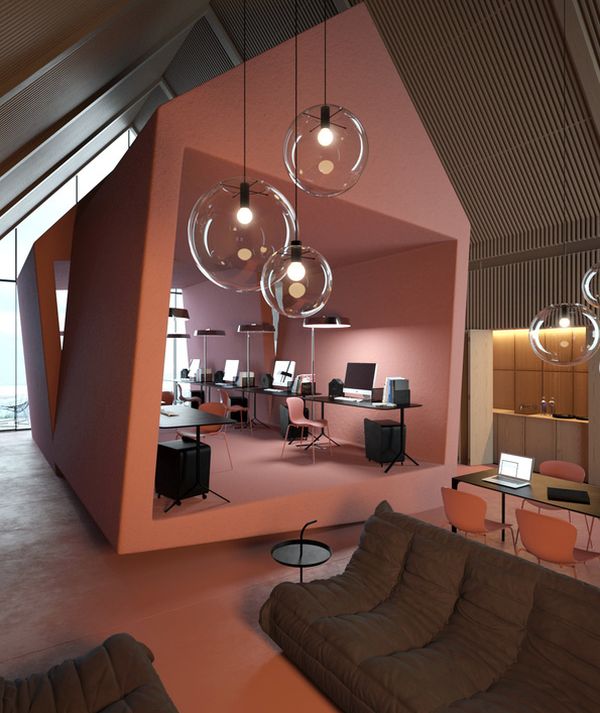
| Stylish and cozy attic office by Vasiliy Butenko Posted: 03 Sep 2012 09:04 AM PDT The general image that we have about offices is that of a space of relative dimensions with a desk, a chair, some shelves and other storage spaces and a décor that's rather cold and neutral. But this is not a rule. Some offices are very pleasant and cozy spaces. This one, for example, is an attic office and it's a very stylish space.
The office was designed by Vasiliy Butenko and the main idea behind the project was to give it a homey feel, to try to change the classical office image people expect and to make something cozy and inviting. The result was an office that doesn't really feel like an office. This is either very good or very bad, depending on how easily distracted and lazy you are. The architect tried to show everyone that a commercial office space doesn't necessarily have to be rigid and cold.
The attic office features a series of working table that are a really nice touch because they are very functional and great for discussing and working at team projects but they also give the office a homey feel and a more casual and relax look. There are several floor plans in this space.
They delimitate different areas. For example, the desks are all gathered in a semi-enclosed space and sit on an elevated platform. The lighting system chosen for the entire space is stylish and takes the idea of a cozy and stylish atmosphere even further. The color palette is also unusual for an office but it's one of the reasons why this space feels so relaxing and inviting. Subscribe to Homedit's Feed to get constant updates of our Awesome Posts!© Homedit- Daily interior design ideas ! | Permalink to Stylish and cozy attic office by Vasiliy Butenko |
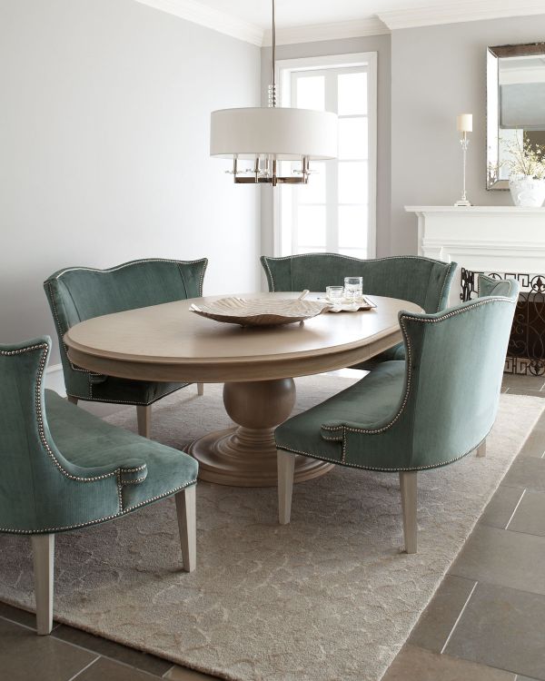
| 5 Velvet Accent Features For This Fall Posted: 03 Sep 2012 07:42 AM PDT Velvet is a very beautiful fabric but it's also a very pretentious one. You need to be careful when using it because it can easily change the whole décor of a room. We have found five beautiful pieces that allow velvet to be the star of their design and that would make beautiful new addition for your home this fall. 1. The fuchsia sonia velvet chair.
This chair is part of the Jeff Zimmerman Collection. It's a beautiful piece of furniture with an elegant deign and a lovely shape. It has nail trimmed accents and it's handcrafted from rubber wood. It features fuchsia silk and rayon velvet upholstery. Its overall dimensions are 32″W x 30″D x 40″T.Availabel for 2119$.
2. The Brumley velvet banquette.
This is a piece that is also part of the Jeff Zimmerman Collection along with the Prudence pedestal dining table featured in the picture. They work well as a set. The banquette features a maple frame with an antiqued white finish and cotton/rayon upholstery. It also has silvery nail trim details around the back of the arms and base. The overall dimensions of the banquette are 57″W x 31″D x 38″T.Available for 1917$. 3. The Elton settee.
This is another charming piece of furniture for the living room. It's a beautiful settee with a high back and deep tufting. It has gently sweeping arms and legs and it's also great for the bedroom or the library. It's a very comfortable piece and it could even be used as a dining room banquette. It has a solid wood frame, solid wood legs with chocolate-stained finish, button tufting details and several options for the upholstery. The overall dimensions are 60″w x 31″d x 32.5″h.Available for 647 euros. 4. The Nador velvet cushion.
And since any home also needs some colorful accent pieces, we present you this lovely cushion. It features a zig-zag pattern and features several colors. The cover is removable and is made of 79% viscose, 21% cotton. The cushion is 50% down, 50% feathers. When placed against a neutral background it really pops.Available for 325$. 5. The Mulberry velvet window panel.
Velvet curtains are yet another way of making your home look sophisticated. The Mulberry window panel is indeed a great accent feature. It has stainless steel grommets and cotton velvet curtains and it adds a modern, industrial accent to any room. All panels are 48″w and sold separately.Available from 54 euros. Subscribe to Homedit's Feed to get constant updates of our Awesome Posts!© Homedit- Daily interior design ideas ! | Permalink to 5 Velvet Accent Features For This Fall |
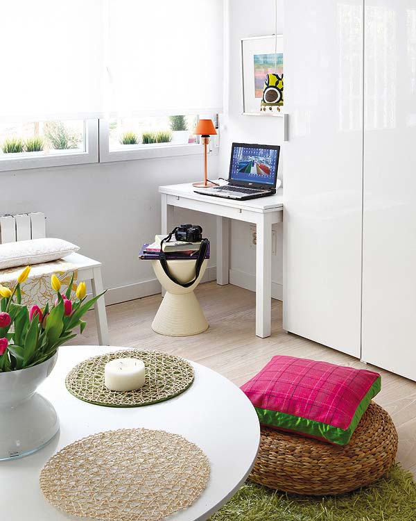
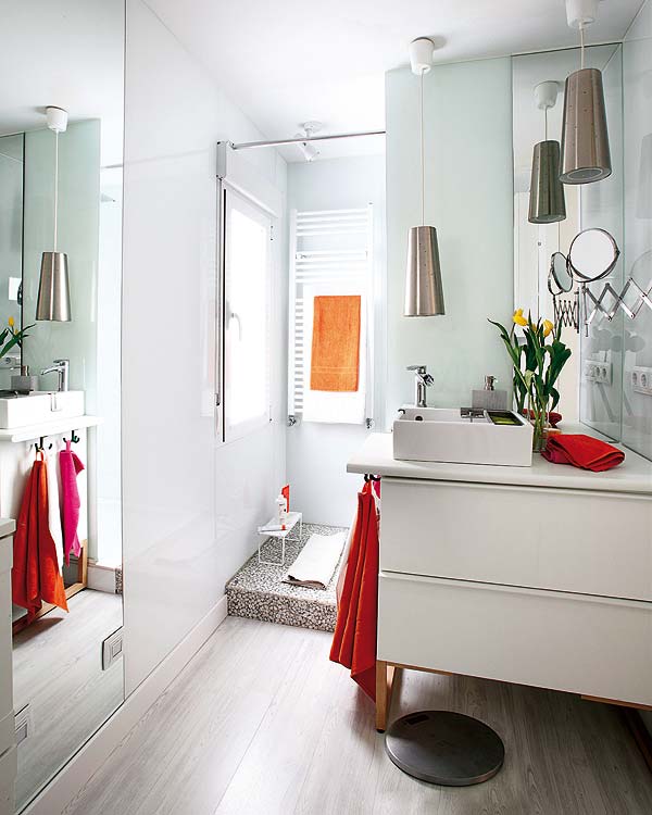
| A refurbished 40 square meter apartment with a colorful interior Posted: 03 Sep 2012 06:46 AM PDT This is an apartment that measures 40 square meters across. It's small but, as you can see, it doesn't lack style. Like in most cases, the owners decided it was time for a change. They wanted to make the apartment more functional, considering the size of the home. The solutions were very clear from the beginning. Many walls had to be demolished. This allowed the creation of larger, open spaces where the interior is airy and that really changed the way the apartment looked like.
The change was drastic. All the partitions were demolished and a series of shared spaces was created instead. As for the new style chosen for the décor, it's simple but very dynamic and cheerful. The apartment features a neutral background that serves like a blank canvas for all the colorful pieces of furniture and all the decorations and accent pieces. The apartment is now divided into two rectangular spaces of similar dimensions. The first volume includes the hall, the kitchen, the living room and a study corner. The other one is a private volume that includes the bedroom and bathroom.
Since all the walls were knocked down, this allowed the creation of a cosmopolitan-style apartment, perfect for renting. Both volumes have plenty of storage areas. They come in the form of cabinets or shelves. The furniture was chosen in a way that would allow it to integrate perfectly into each space. The décor is neutral and serene with strong splashed of color.{found on micasarevista}. Subscribe to Homedit's Feed to get constant updates of our Awesome Posts!© Homedit- Daily interior design ideas ! | Permalink to A refurbished 40 square meter apartment with a colorful interior |
| Posted: 03 Sep 2012 05:09 AM PDT A kindergarten must be a very safe place, without any dangerous things near children. With the budget of 851.722,56 €, in 2009, the architects of Duch-Piza Arquitectos managed to make in Mexico City, Mexico a perfect and safe place for parents to leave their children. They actually made an extension of an old kindergarten from 1930. So, it has a "U" form so the play ground is surrounded by the actual building.
Is a perfect way to keep the kids inside and let them play freely. Even if it fallows a part of the existing building, the designers managed to bring a new and safe side to this kindergarten. The big rooms and few and only necessary furniture give a lot of place for the little ones to play and have fun.
They choose the white color for the walls, so they can play with the ceilings and floors. So, they used a lot of other calm colors such as yellow or orange to bring a cozy and quiet atmosphere. And, they let the colored furniture to bring happiness to the place. With no dangers around, with the windows very high and massive doors that can`t be opened by the kids, this kindergarten is a very safe one for the Mexican children.
If you want your little ones to be safe and do their daily playing and activities in a nice atmosphere, this is the perfect place for them. Nice and yet very cozy and happy, it will be a delight for them to go there and not like a punish, how most of the children perceive their days when they go to kindergarten. Subscribe to Homedit's Feed to get constant updates of our Awesome Posts!© Homedit- Daily interior design ideas ! | Permalink to The perfect Kindergarten |
| Posted: 03 Sep 2012 03:04 AM PDT Fanfares are bands of people marching and singing and playing instruments in a loud and conspicuous way. Just like them, thus Fanfare Clock from Saatchi needs not do anything to draw your attention. It will immediately be noticed and appreciated, hated or loved , but it will never leave someone without reaction. This clock is totally special first of all because or thanks to its design. It is simple and so beautiful at the same time, as it is made of twelve colourful plastic fans, each for one hour displayed on the clock. These fans can be combined in different ways so as to obtain the perfect chromatic combination that will go with the room.
For example dark brown is combined with black and white fans and has red arms in order to get visible. Or the orange and red version with golden clock arms is simply vivid and alive and makes your heart beat faster when you look at it. You do not need numbers to tell the time, as each fan does this job and, apart from the usefulness of the item, it is a wonderful piece of design that can be used to arrange your house and make it look great for about £40.00. Subscribe to Homedit's Feed to get constant updates of our Awesome Posts!© Homedit- Daily interior design ideas ! | Permalink to Fanfare Clock from Saatchi |
| Bring your Gadgets in the Shower Posted: 03 Sep 2012 02:27 AM PDT Do you know that awkward moment when you’re watching your favorite movie at TV and you have to go to have a shower because you’re late to a meeting? Well, I hate those moments. But, of course nowadays the designers found a solution even for this problem. Now, you can listen to your favorite music or watch a movie while you’re taking a shower.
Designed by Fei Chung Billy Ho, this project comes in help of those who can’t stay away from their gadgets even when they are taking a bath. With a stainless steel structure, OLED interactive glass paneling and display panels to synchronize with tablets and smart-phones, it would be the best invention in the IT industry.
And even if it’s extraordinary, that`s not all of it. For a more relaxing atmosphere, the shower comes with a designed water control stem that relies on illumination and see-through channels.And, it is also a very sure way for you because it has an anti-bacterial cypress wood base with surrounding drainage systems that disposes bacteria, funguses and viruses. So, it is also healthy not only fancy.
Imagine how it will look in your stylish and luxurious house. The perfect piece for the gadget lovers and not only, the Smart Media Shower will save you some time and will make you have a nice time when you want to relax for a long bath. Just put your favorite music or your favorite movie and enjoy. Like couldn`t get better than that.{found on luxatic}. Subscribe to Homedit's Feed to get constant updates of our Awesome Posts!© Homedit- Daily interior design ideas ! | Permalink to Bring your Gadgets in the Shower |
| The Sleek and Stylish Chimo Square Wood Rack Posted: 03 Sep 2012 01:41 AM PDT A fireplace is a very beautiful accent feature in any home. It drastically changes the whole décor. You can create a relaxing area in front of the fireplace by placing one or two cozy armchairs, maybe even an ottoman or footstool and just relax there while watching the flames and listening to the wood burn. But simply having it there is not enough. You have to take care of the whole area around it. For example, you need to have a beautiful wood rack to place near the fireplace.
This is the Chimo Square Wood Rack. It's a sleek stainless steel log basket with a simple and practical design. It's also a stylish accessory for the fireplace. Given its simple and versatile look, it has the potential to be easily used in a variety of different decors. It's made of stainless steel and has black wooden legs with rubber grips on the side handles.The Chimo Square Wood Rack is manufactured by Blomus and can be purchased at the price of $220.49. Its overall dimensions are 15.80''l x 17.78''w x 11.85''h. It weights 14.17. The product will be delivered to you in approximately 2 to 3 business days. It's just what you need for your fireplace. It's simple and versatile and it also has a sleek and stylish design without having any extra features that would make it difficult to match with the rest of the décor. Subscribe to Homedit's Feed to get constant updates of our Awesome Posts!© Homedit- Daily interior design ideas ! | Permalink to The Sleek and Stylish Chimo Square Wood Rack |
| Posted: 03 Sep 2012 12:50 AM PDT History repeats itself again and again and so does fashion. And we call it “retro style”. Well, many time all the new designers take a step back and look at the old things that were famous some time ago: masterpieces of designed that appeared in the twentieth century. They admire them and give them a new interpretation – their interpretation and give birth to a new and fresh item instead of throwing the old piece in the trash. Meet Arion Lamp, a lamp that was reborn from its own ashes, thanks to a visionary designer, added a few modern touches and manufactured again after an iconic midcentury lamp. The old lamp used to be a lot smaller, so what it lacked was size. It overcompensated now with bigger proportions (26″H x 17.5″ D x 6″W) and an impressive marble base that offers the lamp enough stability to put it on the side table, desk and even floor.
The rest of the lamp is made of steel, with a brass lamp shade, which gives it a bit of an industrial look. Its maximum wattage is 25 per socket, but the light is focused, so it is perfect if you want to concentrate it on a particular surface like a desk for example. The lamp is elegant and shiny and somehow its shape resembles a snowdrop. You can have it for $620 from Dwell Studio. Subscribe to Homedit's Feed to get constant updates of our Awesome Posts!© Homedit- Daily interior design ideas ! | Permalink to Arion Lamp |
| You are subscribed to email updates from Home Decorating Trends To stop receiving these emails, you may unsubscribe now. | Email delivery powered by Google |
| Google Inc., 20 West Kinzie, Chicago IL USA 60610 | |


0 comments:
Post a Comment