Homedit.com Interior Design & Architecture Inspiration Newsletter | .png) |
- 7800 Çeşme Residences-Hotel by Emre Arolat Architects
- Sorgente Built-In Whirlpool Bathtub by Teuco Guzzini[Video]
- Color Makes the Difference in a 71m flat
- Ford Projects Office Interior Design by Rafael De Cardenas
- Back To School:Creative chalkboard top desk for kids
- Meat Packing District Inspired Restaurant in Melbourne
- Villas and E-WOW Suite interiors
- Add luxury to your house with French windows
- An Impressive Family House by Ricardo Bofill Taller de Arquitectura
- The Peterson Residence by Robert Gurney Architects
| 7800 Çeşme Residences-Hotel by Emre Arolat Architects Posted: 31 Aug 2011 10:57 AM PDT Located in Ceşme-izmir, Turkey, this impressive building was project completed in 2008. It was a complicated project and a lot of people had to work on it. The architects working at this project were Emre Arolat Architects and the project team was formed of Zeki Samer, Mürüvvet Gülcan Sahin, Nesime Onel, Gözde Sazak, Tayfun Aksoy, Gülin Derman, Olcay Ozten, Ufuk Berberoğlu, Murat Sahin and Serkan Duman.The interior design was created by Dara Kırmızıtoprak.
This 15,734 sqm is an impressive structure. However, the main purpose was not to make it stand out but rather to hide it behind the landscape layer. As a result, the building has a very simple, neutral and quiet exterior design that doesn't stand out as much as it could have. Nevertheless, the size of the building can't be hidden so it's impossible to make it go unnoticed.
The residence/hotel features a large swimming pool, kept private by massive walls. It also has large garden terraces on both sides, so the guests can enjoy some quiet time without being bothered. Even though the hotel is hidden behind the landscape and it's not visible from far away, once you get inside you're glad you found it. It's a place where you can have privacy and intimacy and enjoy some calm and relaxing moments.{found on archdaily} Subscribe to Homedit's Feed to get constant updates of our Awesome Posts!© Homedit- Daily interior design ideas ! | Permalink to 7800 Çeşme Residences-Hotel by Emre Arolat Architects |
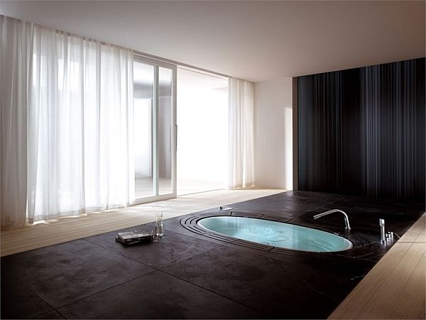
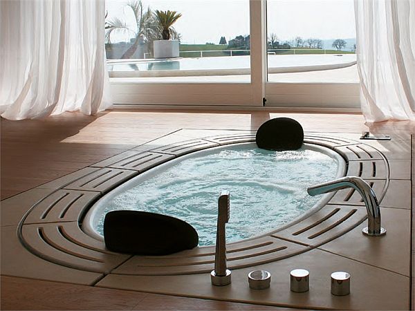
| Sorgente Built-In Whirlpool Bathtub by Teuco Guzzini[Video] Posted: 31 Aug 2011 10:15 AM PDT If you really want t experience something unique and non-replicable, you should take a look at this amazing bathtub. In fact, Sorgente is more than a bathtub. It offer a very special and unique experience, like nothing else you could describe. Sorgente is a built-in bathtub, with a simple but very chic and very sophisticated look, It was designed by Lenci Design.
Sorgente offers two options: a hot tub and a bathtub. You can use either one as you please. Everything was meant to make your experience more relaxing. The bathtub is equipped with 8 hydrosilence whirlpool jets and it’s operated using a remote control. Those 8 jets might sound scary but the truth is that they are extremely quiet as not to disturb or interrupt the calm and relaxing atmosphere.
Another unique and interesting detail is that this bathtub fills automatically and all you have to do is get in and enjoy a good time. Sorgente also features a magnetic headrest as well as pull-out shower with a flexible hose, in case you prefer to take a shower. So it’s not just a simple bathtub, but a combination of three elements. Moreover, it’s elegant and chic design would instantly make anyone fall in love with it. So allow yourself to have a relaxing and quiet time just for yourself. You’s need enough space in your home, but other than that there’s nothing to worry about. Subscribe to Homedit's Feed to get constant updates of our Awesome Posts!© Homedit- Daily interior design ideas ! | Permalink to Sorgente Built-In Whirlpool Bathtub by Teuco Guzzini[Video] |
| Color Makes the Difference in a 71m flat Posted: 31 Aug 2011 07:52 AM PDT Color is among the most important aspects we must take into account when we design our dream home, the perfect instrument that dominates any space. The flat in the picture with its neutral base is emphasized by the strategic use of color. The monochromatic base gives unity to the entire place, while the shades of color provide the so-necessary personality of the house.
The choice of grey for furniture and upholstery, plus the accents of stainless steel create an inviting environment. Alvaro & Gonzalo Irazabal, the owners and the architect, Begona Ronchel reconditioned the floor and the result is very successful, underlining the communication between spaces.
The choice of colors is inspiring, every little colored thing suggests life, passion and the joy of appreciating details, the beautiful part of life. It does not matter if it is a colorful painting on the wall, a red pillow on the sofa, the red kitchen tile or an entire wall, all these are necessary marks that contribute to the decorative harmony we appreciate so much in a home.
The floral wallpaper or the "written" one in a bathroom or the elegant black and white combination in the other bathroom are only some aspects that highlight the simplicity, beauty, personality and good taste that characterize the entire space, a model of modernity and ingenuity in which color is the essence.{found on micasarevista} Subscribe to Homedit's Feed to get constant updates of our Awesome Posts!© Homedit- Daily interior design ideas ! | Permalink to Color Makes the Difference in a 71m flat |
| Ford Projects Office Interior Design by Rafael De Cardenas Posted: 31 Aug 2011 04:41 AM PDT Rafael de Cardenas of Architecture at Large has developed many projects and has a developed a particular style. He is known for the creative designs and the use of bright colors and geometrical shapes. However, when it came to designing the offices for Ford Projects, those elements had to be reconsidered.
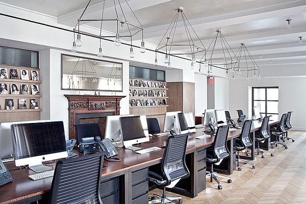
The new project involved the new art gallery branch of the great Ford Modeling Agency. It’s located in the penthouse of a historic building on New York’s Upper East Side. The place was previously a private residence and was then morphed into a a beautiful art gallery and office space for the employees.
The design is a combination of modern and 1920s décor. So the interior features contrasting elements like modern sofas and chairs wrapped in fine velvet, a cozy fireplace, 1920s style globe light fixtures and oak wood walls.
In order to create a more open and harmonious place, the cubicles were replaced with desks that were then stretched together to create a more comfortable and family-like work place. This helps create a more relaxing and harmonious atmosphere. The art gallery is separated from the office space and they don’t share the same design. So the usual colorful and geometrical designs that define Rafael de Cardenas has to be tempered and toned down a little. Nevertheless, the result is a unique and very beautiful design. Subscribe to Homedit's Feed to get constant updates of our Awesome Posts!© Homedit- Daily interior design ideas ! | Permalink to Ford Projects Office Interior Design by Rafael De Cardenas |
| Back To School:Creative chalkboard top desk for kids Posted: 31 Aug 2011 03:05 AM PDT We all know how kids like to use the chalk. At one time I was using it to write all over the bedroom furniture. Of course, it was simple, common furniture that eventually got ruined, especially considering that I was also using a wet sponge to wash it. Well, you can avoid all that by buying your kid an actual table on which he can write with chalk.
The Lipper Child’s Desk With Chalkboard Top is a must-have for any parent. It's a very functional piece of furniture because it has plenty of storage space for all sorts of things like games, books, crayons or other materials the kids might use for their creative projects, even for toys and other small objects. The most important part of this desk is probably the chalkboard top. The kids will love to write and draw on it. And if you're a clever parent you can even make homework fun by asking them to write it on the board. The dimensions of the desk are 25-1/2″w x 16″d x 26″h and it also comes with a matching chair that measures 11-3/4″w x 13″d x 23-1/2″h. The set is for toddlers up to school kids. You can purchase this creative desk for $78.48. It comes in Pecan or Espresso finish. Subscribe to Homedit's Feed to get constant updates of our Awesome Posts!© Homedit- Daily interior design ideas ! | Permalink to Back To School:Creative chalkboard top desk for kids |
| Meat Packing District Inspired Restaurant in Melbourne Posted: 31 Aug 2011 02:20 AM PDT Modern elements and vintage paintings and photographs is what defines this Atlantic Restaurant and everything was designed by Blackmilk Interior Design. Located in Melbourne, Australia, this charming place was inspired by the famous New York meat packing district.
Taking as an example the hustle and the bustle of the fish markets of years gone by, in New York and Chicago, this unique restaurant is a great place to have a lovely meal or a drink. It has superb features, such as weathered timber and incorporated elements of the traditional Persian rug into the carpet.
The architects tried to give it a homely feel and an interesting design that will leave you speechless. Furthermore this 300 seat restaurant features an industrial aesthetic incorporating steel framed glass, screens and varying floor heights to create a series of private dining rooms with nautical names like “The Cabins” or “Engine Room” inscribed in silicone on the dividing glass doors. The Atlantic Restaurant is a contemporary space where lighting is extremely important due to the big amounts of dark tones used throughout the entire place.
It is a gorgeous restaurant filled with stunning details that will blow your mind. It is modern, yet it has some traditional elements as well. It os perfect for parties, cozy and chic, the perfect match for a cool night out. Subscribe to Homedit's Feed to get constant updates of our Awesome Posts!© Homedit- Daily interior design ideas ! | Permalink to Meat Packing District Inspired Restaurant in Melbourne |
| Villas and E-WOW Suite interiors Posted: 31 Aug 2011 12:00 AM PDT Nothing compares to the feeling you have when you are in a house or a room where you feel so good that you do not want to leave anymore.This is the feeling you want to find at home, but it does not happen always. The Villas and E-WOW suite interior are the kind of places where you have that unmistakable feeling!
They were designed by AB concept for the W Retreat & Spa Bali – Seminyak and represent the ideal place where you can relax and enjoy every moment of endearment. First, no matter the room, they are all good-looking and share an open feel that relaxes, a modernity that impresses and a unique style of bringing the outside in.
The entire atmosphere seems to be the definition of comfort and relaxation; the warm tones of blue, yellow, orange are inviting, as every little thing in this modern and cozy environment, which seems to be an image of the future.
The large bathroom is only an example of a pleasant space that provides comfort, but this is the purpose of all the interiors and all the villas. The bedroom is the expression of simplicity and comfort in a perfect environment; the bathroom is simple but interesting if we look at the shape of the tub, without mentioning all the objects that show quality and good taste.{found on contemporist} Subscribe to Homedit's Feed to get constant updates of our Awesome Posts!© Homedit- Daily interior design ideas ! | Permalink to Villas and E-WOW Suite interiors |
| Add luxury to your house with French windows Posted: 30 Aug 2011 11:16 PM PDT To make a home look attractive and decorative, creativity and idea is needed while choosing each item be it furniture, decorative accessories, curtains, doors and even windows. Home is a place where you can forget your official tension and relax after the day’s hard and hectic schedule. In a cold winter evening, after returning from office, get fresh, sit in front of the fireplace and have coffee with your spouse.
The warmth from the chimney and hot coffee will wipe away all your tensions and relax your muscles. I bet nothing can be more relaxing than this. This pleasure will double when your home has a very cozy and luxurious look. To add luxury without huge investment French windows are a good choice.
French windows are generally bigger in size as compared to the other types. Typically, French window is a door fitted with panes of glass. When it comes to giving maximum sunlight and ventilation, French windows tops the list. White color best suits French windows. Though of course the selection of color depends on you, but when it comes to French windows it is better to select white or cream color. No other color can stand in comparison to it. You can go for either clear glass or the frosted glass. When fitted in the outer walls it makes your home look very pretty from outside. During daytime your house will get enough of sunlight and fresh air and after dark, due to the glasses it will appear as if your home is glowing from inside.
A French window adds a very unique beauty and elegance to your home. Highlight the windows with beautiful curtains. You can even give a airy touch with lace curtains to make it look even more luxurious. Another way is to add drapes. Since French windows are light in color like white, cream, so go for dark color curtains. Coffee, maroon, brown are some of the color that will complement the window.
Also, if you are placing any furniture infront of the window then make sure that it also has a dark color. This will make the windows more prominent. Instead of short curtains use long floor touching ones. These windows are excellent way of transforming even a small apartment into a luxurious one. It not only helps in decorating the house but also serves as a single leaf door, double leaf door, sliding door or folding door. Moreover, it allows sufficient fresh air and light in the house. Subscribe to Homedit's Feed to get constant updates of our Awesome Posts!© Homedit- Daily interior design ideas ! | Permalink to Add luxury to your house with French windows |
| An Impressive Family House by Ricardo Bofill Taller de Arquitectura Posted: 30 Aug 2011 10:41 PM PDT There are houses that impress through size and greatness, others through shape and beauty and others through simplicity and elegance or modernity and charm. This summerhouse, located in Girona, the northeast of Catalonia, Spain is impressive through its greatness, shape and design at the same time.
If we take into consideration the fact that the Spanish architect Ricardo Bofill designed it, there is no surprise that it suggests safety and power. Completed in 1975, the residence was built on a rectangular platform, around the ruins of an old farmhouse, being surrounded by a landscape of hills and woods.
One of the most interesting aspects is the way the ruins were incorporated into the volumes of the house. There are several pavilions built around a central exterior space, the pool and the main dining room; the high walls that give that impression of comfort protect the corners of relaxation.
The five independent modules are dark brown on the exterior and red ceramic on the interior. Once you see the residence that looks like a fortress, you also see a rich environment, a large and beautiful yard, protected by the stone pillars that surround it. Not only the outside is impressive through beauty and strength, the inside is the best example of an open place with warm colors, where you can enjoy time with your friends and family. The rooms are so wide, that you have the impression of being in a palace and everything around is at your disposal, as in a dream. Subscribe to Homedit's Feed to get constant updates of our Awesome Posts!© Homedit- Daily interior design ideas ! | Permalink to An Impressive Family House by Ricardo Bofill Taller de Arquitectura |
| The Peterson Residence by Robert Gurney Architects Posted: 30 Aug 2011 10:00 PM PDT Located in Chevy Chase, Maryland, this beautiful residence was actually a renovation of an already existing structure with some additions as well. The project was developed by Robert M. Gurney, FAIA for Peterson and Collins Inc. and it was completed in 2009. The interior design belongs to Therese Baron Gurney, ASID.
The main challenge was to transform the old and already existing building into a new and completely different structure. Several substantial additions had to be made. The majority of the new structures were added to the back of the house, as not to radically change the look of the house, as seen from the street. Tall windows were added instead of the small ones, a new front porch, as well as wide stairs. The living spaces were relocated to the garden area of the property, this way separating them from the rest of the rooms and allowing ore privacy.
Among the materials used in the process, we can mention the quarter-sawn white oak cabinetry and millwork, dark stained oak flooring, and mahogany screens, combined with travertine, black granite and limestone.
The garden is a very relaxing space, created by using dry-stacked stone, mahogany, steel and copper roofing. Walkways have been added, as well as a new terrace. This project is a very good example that shows us we don't necessarily have to start from scratch when building a modern home. You can also reuse existing structures, renovate them and turn them into a completely new place.{found on archdaily} Subscribe to Homedit's Feed to get constant updates of our Awesome Posts!© Homedit- Daily interior design ideas ! | Permalink to The Peterson Residence by Robert Gurney Architects |
| You are subscribed to email updates from Home decorating trends To stop receiving these emails, you may unsubscribe now. | Email delivery powered by Google |
| Google Inc., 20 West Kinzie, Chicago IL USA 60610 | |


0 comments:
Post a Comment